I was never not going to like this book.
I enjoy and admire great design, and fascinating facts and little stories about brands are my stock in trade, so a combination of the two, was always going to be a winner.
Add to this, the fact that JKR are big enough to feature and celebrate work that isn’t their own (not many design agencies would do that) and that the book is itself extremely well designed, and you do indeed have a really good book.
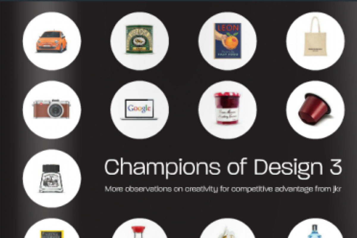
It’s an easy book to enjoy, 35 brands including Bombay Sapphire, Gitanes, Leon and National Geographic, each with a review by either Andy Knowles, Silas Amos or James Joice, a timeline and a selection of six little anecdotes (one of which is a ‘porky’).
The reviews are interesting though one or two are akin to short, sometimes slightly gushing love letters. The best explain and discuss the design ethos and the origin of the identity. Some draw interesting points of learning about the use and understanding of design.
My favourite is written by Joice who sets it up brilliantly, painting a picture of a hypothetical presentation.
"‘So we are going to use a lion to represent the brand,’ the agency explain to the client, who nods in approval. ‘We believe the lion should be lying down. Dead in fact, and surrounded by a swarm of bees.'"'
Yes, Lyle’s Golden Syrup does indeed use a dead lion as an icon ( I wonder how many of you are now Googling it now to check it out).
He goes onto explain that the image in question references an Old Testament story in which Samson kills a lion but then sees a swarm of bees has created a honeycomb in its carcass. Samson says 'Out of the strong came forth sweetness'. The words are incorporated into the design of the tin.
The message Joice draws out is that 'We don’t deconstruct individual elements to look for meaning. Instead we see design more holistically – as a symbol that triggers associations that are built up over time.'
It is in one of the other reviews that Amos tells us their criteria for the selection of the Champions of Design, namely 'brands where design has played a crucial part in business success'. Again this is probably JKR being refreshingly honest as the reviews rightly highlight that in many cases there are many other elements of the brands’ success and it’s not all down to design.
In fact I would suggest that for a few of the chosen brands, the design itself isn’t really that exceptional or indeed that important except in so far as it has become famous as the brand has grown and gained status and meaning. For me The Economist isn’t really a champion of design, it’s a great brand based on a great product and perhaps since 1988 when the ‘White out of red’ campaign began, it’s a champion of advertising.
As the title suggest this is the third volume in a series, and the other volumes can be downloaded at the Kindle Store. I for one, will be doing that.
Join our Book Club. If you're a member of The Marketing Society we'd love you to write a 300-word review for our Clubhouse. Or if you're an author get in touch. We've got lots of members keen to review your book. Contact Michael Piggott to find out more.