
At the core of every brand beats a living and ever-evolving identity. The more meaningful a consumer perceives an identity to be, the more likely they are to engage in a long-term, loyal and trusting relationship with that brand.
Shaping an industry-leading brand identity is difficult enough within a single market, but this task becomes even more complex when considering the intricacies of communicating across multiple cultures and languages.
This month, Creative Culture is focusing on the Dulux brand, which recently went through a revamp, with the aim of establishing a strong and more consistent identity across all of its markets.
To gain a first-hand look at what made this global re-branding initiative so glocal, we sat down for a Q&A session with international brand design agency Design Bridge, which played a pivotal role throughout the Dulux brand transformation.
Seeking to understand the key elements that enabled this masterbrand to establish its status as a global leader in premium paints, our team spoke with Group Strategy Partner, Simon Black, who oversees all of the agency’s work with the Dulux brand.
Seeking to understand the key elements that enabled this masterbrand to establish its status as a global leader in premium paints, our team spoke with Group Strategy Partner, Simon Black, who oversees all of the agency’s work with the Dulux brand.
What was the geographic scope of the re-branding project?
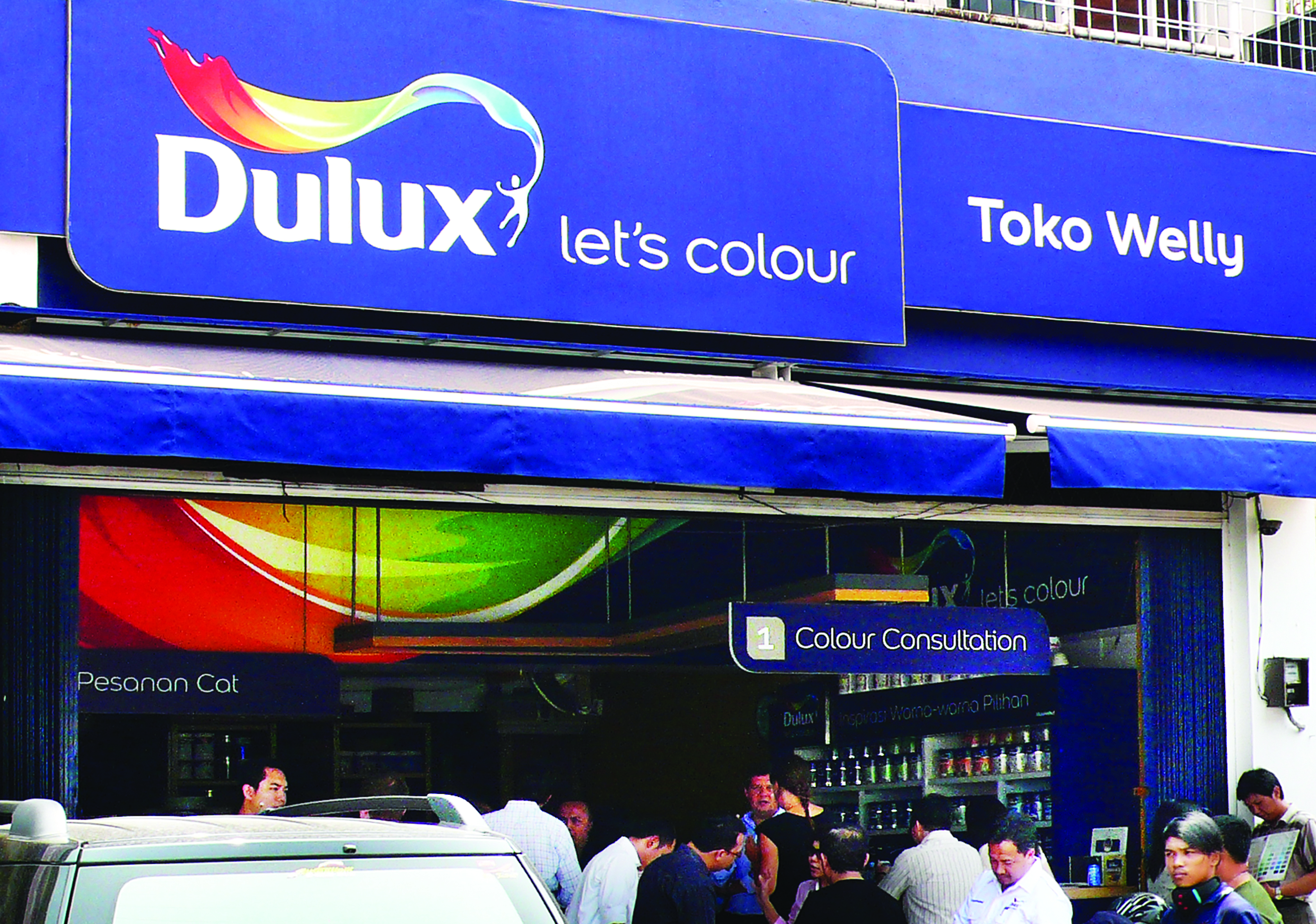
The scope covered approximately 50 markets across Europe, Asia, Africa and the Americas. At the start of the project in 2008 (just after the Dulux brand was acquired by AkzoNobel), the Dulux brand name had a strong heritage in a number of markets, but there were certain territories where the name was not as recognized. Also, it was also important for us to consider that the brand operates under different names within certain markets (i.e. Inca in Uruguay, Coral in Brazil, Flexa in the Netherlands).
The scope covered approximately 50 markets across Europe, Asia, Africa and the Americas. At the start of the project in 2008 (just after the Dulux brand was acquired by AkzoNobel), the Dulux brand name had a strong heritage in a number of markets, but there were certain territories where the name was not as recognized. Also, it was also important for us to consider that the brand operates under different names within certain markets (i.e. Inca in Uruguay, Coral in Brazil, Flexa in the Netherlands).
Where did your (Design Bridge’s) inspiration for the logo and tag line come from?
It was definitely a collaborative effort between the Dulux teams and our teams, but the inspiration came from an overarching brand sentiment we all sought to embrace: colour can change more than just walls; it can change the emotions of the people who live within them – and what comes out of a small paint tin can cover a large space – it’s a multiplying effect. We walk into a room and we react to the colour around us. It actually plays a huge part in emotional/psychological wellness. Sometimes it’s making a fresh start – or it’s making a place your own. It’s a very positive and unifying insight. This inspiration was rooted in the brand’s vision, which is to add colour to people’s lives. So we had to view this through values such as trust, originality and personality – that’s the nature of the flourish logo. The tagline and logo are just the beginning. We support Dulux through the development of its primary identity – this means we’re here to ensure the tonality of the brand and the stature of the products meets the brand standards, regardless of the market.
It was definitely a collaborative effort between the Dulux teams and our teams, but the inspiration came from an overarching brand sentiment we all sought to embrace: colour can change more than just walls; it can change the emotions of the people who live within them – and what comes out of a small paint tin can cover a large space – it’s a multiplying effect. We walk into a room and we react to the colour around us. It actually plays a huge part in emotional/psychological wellness. Sometimes it’s making a fresh start – or it’s making a place your own. It’s a very positive and unifying insight. This inspiration was rooted in the brand’s vision, which is to add colour to people’s lives. So we had to view this through values such as trust, originality and personality – that’s the nature of the flourish logo. The tagline and logo are just the beginning. We support Dulux through the development of its primary identity – this means we’re here to ensure the tonality of the brand and the stature of the products meets the brand standards, regardless of the market.
To what extent was local market cultural insight used as a means to understand what would/wouldn’t work globally?
The research process involved an extensive amount of international collaboration. Creative work was developed in all of our global offices (London, Amsterdam, Singapore and New York), however we worked closely with researchers across many more markets. International knowledge centres were drilled for insight, from the very beginning. Contemporary cultural reference points were established by asking questions such as: what does colour, paint and painting mean to the local consumer? and what role does it have in their lives? The goal of our research was to one day, be able to tell a global story about a united idea – one that would have a very positive resonance in every target market. During this stage of the project, I can’t tell you how important it was to establish effective channels of communication from each market.
For a brand previously leaving most of the marketing power in the hands of the local markets, how did the agency assist Dulux in connecting these markets with a more consistent message and look-and-feel?
One of the most important things to consider here: like any other multinational, there is always a constant balance that needs to be struck between the centre and its markets. This certainly wasn’t an easy task. It was one that required a very delicate and sophisticated approach. Specifically, we needed to talk about having a brand centre and an effective means to quickly escalate any issues internally – but none of this could be established without clear leadership and clear business vision. The journey towards the unification of a theme or idea requires it to be a big enough, strong enough and bold enough idea, so that it can sit across a category, rather than just a brand – and it has to have a truth rooted in the products you’re working on. The ideas that Dulux has as a brand are so big that they drive category growth, not just brand growth. In the end, this clarity has to come with a clear enough vision, so that each market can see itself in it, somewhere. Still to this day, we work in a number of markets, to ensure the clarity of vision flows through all pillars of the products.
One of the most important things to consider here: like any other multinational, there is always a constant balance that needs to be struck between the centre and its markets. This certainly wasn’t an easy task. It was one that required a very delicate and sophisticated approach. Specifically, we needed to talk about having a brand centre and an effective means to quickly escalate any issues internally – but none of this could be established without clear leadership and clear business vision. The journey towards the unification of a theme or idea requires it to be a big enough, strong enough and bold enough idea, so that it can sit across a category, rather than just a brand – and it has to have a truth rooted in the products you’re working on. The ideas that Dulux has as a brand are so big that they drive category growth, not just brand growth. In the end, this clarity has to come with a clear enough vision, so that each market can see itself in it, somewhere. Still to this day, we work in a number of markets, to ensure the clarity of vision flows through all pillars of the products.
What was the biggest challenge regarding developing and testing a globally relevant brand identity?
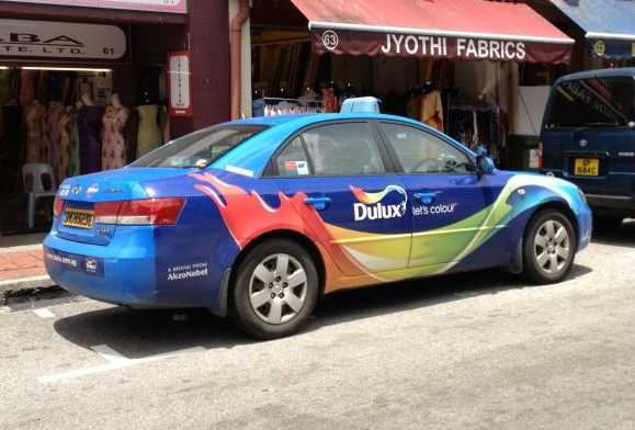
Because we’re an international agency with offices on other continents, it would have been easy to be lazy and therefore a little arrogant in hoping that some of our ideas would resonate across every market – but what I’ve found is that the further away the market is, the more honest, open, and attentive you have to be to understand the very specific market challenges. Local markets should not have to risk their income streams because of untested, untried work – so it was important for us to prove that this concept would work. The resulting proof would require on-going listening and very close interaction between our teams and the Dulux global teams. Local insight was constantly weighed in throughout the project to verify relevance, culture by culture, market by market. The reward for the team’s thoroughness was well worth the effort – I was in Vietnam last week, and smiled as a taxi passed by, sporting the brand’s colourful flourish.
What were your key take-aways from this project?
Never take anything for granted… and never underestimate the complexity of a genuinely global project. Although you might spot an advantage, it’s important to recognize that one man’s advantage is another man’s potential disadvantage.
The first thing you should do when starting a global project is to become a good listener.
You’ve got to get agreement on your insight before you get agreement on execution.
Any concluding thoughts?
We don’t expect Inca in Uruguay to become Dulux, but we do expect Inca in Uruguay to celebrate what the flourish means; to celebrate the overarching sentiment that colour changes more than just walls, it changes the emotions of those who live in them – and if they deliver that insight, then they are delivering the masterbrand.
Read more from Creative Culture in our Clubhouse.