
2015 was a big year for the emoji. Facebook launched a new series with ethnically diverse skin tones; ‘Moby Dick’ was crowd-translated into ‘Emoji Dick’, and in November the Oxford Dictionary named an emoji the ‘word of the year’. Yes, the ‘word’ of the year. Ye Gods, is nothing sacred? I’m speechless. Which is I guess, the point.
Should we all give up and go home? Emoji detractors point to the rise of these cute digital ideograms as a signifier of our collective loss of intelligence. Apparently even summoning the focus to compose 140 characters of text is just too… No, wait. Stop. I. Literally. Can’t. Even. ![]()
But emojis were never intended to replace language. They were invented as a way to inject emotion into dry online communication. And against the best judgement of my inner snob, nothing adds goodwill or humour to a brief SMS or a line of an email like one of these little guys ![]() In the fast, functional and often terse tonality of digital communication, emojis have stepped in where language has fallen short. They augment written communication. But they cannot replace it.
In the fast, functional and often terse tonality of digital communication, emojis have stepped in where language has fallen short. They augment written communication. But they cannot replace it.
To be a credible substitute for written communication, the alternative would need to offer a clear advantage. It would need to be easier to understand; capable of conveying clarity where language brings ambiguity. But pictures can be just as woolly as words. For instance, I have it on good authority that this particular emoji 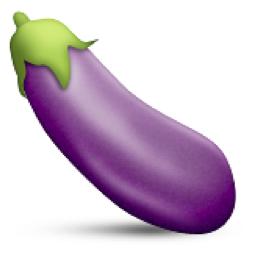 has more than one meaning.
And simple iconography doesn’t always put you in the picture, as exemplified in this brilliant observational piece that Facebook delivered unto my feed:
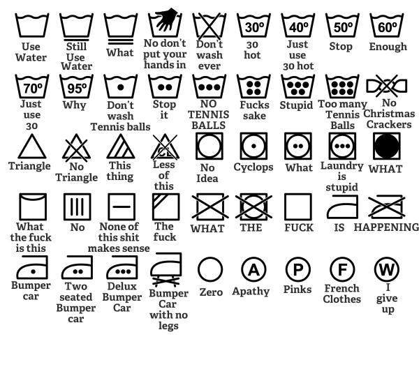
As shown in the incomprehensible laundry icon set, images don’t always explicitly communicate any kind of meaning at all, double or otherwise. Sometimes, we need to learn the ideas they encapsulate. A white rectangle in a red circle is universally understood as a no entry sign, but not because it explains itself to us. We need to learn the meaning behind the symbol – but we only need to learn it once. After that, our understanding is instantaneous.
This, I think, is how some of the most powerful brand design operates. The Nike tick, the Coca Cola wave and the Heineken star - all of these are symbols just like the no entry sign. Unlike the emoji mode of brand design that explains itself pictorially and predictably – these brands never communicate literally. And they are infinitely more powerful – and ‘iconic’ - as a result.
Read more from Katie Ewer and JKR in our Clubhouse.