On the 9th August 2015, Singapore celebrated its 50th year of nationhood. It’s hard to overstate the distance this country has covered in such little time - transforming itself from Malaysia’s smallest and swampiest state to a role model for much of the world’s civic programming, educational and economic policy.
But as someone clever once said, ‘What got you here, won’t get you there’ – a truth acknowledged by policymakers in the government. The next chapter in the Singapore story will include a focus on fostering a more creative economy. So what better way to announce those ambitions than to make design an integral part of the SG50 Golden Jubilee celebrations?
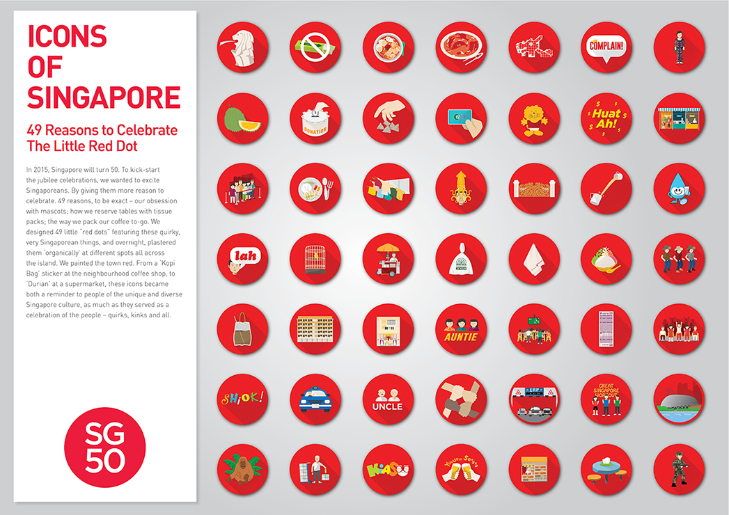
First step: create a brand idea and a strong identity. The SG50 logo is ultra simple – white text out of a red dot. This isn’t arbitrary or unimaginative – there’s a story behind it. Popular culture has it that former Indonesian President BJ Habibie disparagingly referred to Singapore as ‘the little red dot’ – a nation so small and insignificant that it was reduced to a red drawing pin point on world maps. Singapore took the slight to heart, and now uses the phrase proudly. So the little red dot’s golden jubilee logo is … a little red dot. 49 different illustrated icons capturing the quirks of everyday life accompanied the logo, each in a red circle. So far so good.
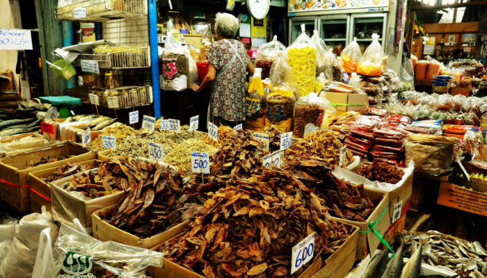
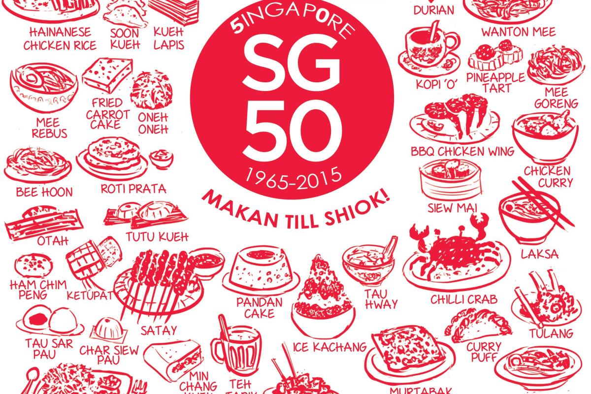
The logo took some flak for being boring and crude. But I quite like it. It would have been easy to design a logo that delivered authority and maturity instead – a traditional crest stuffed full of detail, pomp and ceremony for example. But I like the fact that the organisers went for something simple and young and with a sense of tongue-in-cheek self-deprecation. It seems to say ‘we know that we have the best housing and education in the world and we’ve come from third world to first in scarcely a generation but the thing we’re most proud of is our chicken rice (a local staple) and Singlish (a local patois)’.
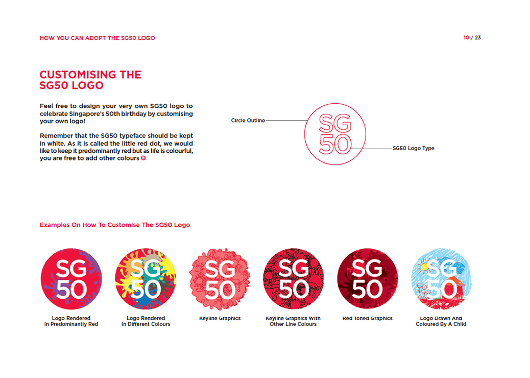
It’s slightly cheesy to say, but it’s an identity designed for ‘the people’. In the brand guidelines issued throughout the country in the run up to the event, businesses were encouraged to customise the logo in (almost) any way they wanted. The guidelines can be downloaded by anyone here:
It’s a shame then, that not many people seemed to read through to that page of the guidelines, opting instead just to rubberstamp the SG50 red dot all over their communication. Singapore looked like it had a bad case of measles by the time August 9th rolled round. This fantastic blog kept a collection of the good, the bad, and the mostly ugly. Ultimately, as with any event like this, initiatives range from crass commercialism (SG50 fish cakes anyone?) to genuine creativity (Check out Edwin Low’s wonderful three-dimensional interpretations here).
Some major national events like this achieve visibility through consistency – think about the top down consistency of an Olympic Games identity for instance. Others, by virtue of their cultural importance, are entirely ‘user generated’ - such as the 4th of July, Chinese New Year or Christmas. The SG50 identity has done a bit of both – combining creativity and personalisation within a branded framework. Textbook stuff – great in theory, challenging in practice.
But I like it anyway. Happy Birthday Singapore.
Read more from Katie Ewer here.